
DESIGN NOTES — CANYON-DESERT
One Tile, One Palette, One Sky
I start every world on this site with one 32×32 tile, one palette, and one sky. Canyon Desert was the first full biome I built that way, and it ended up changing how I work.
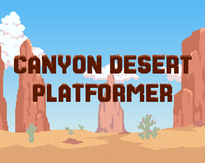
I picked the colors first
Before drawing anything, I chose the palette: five warm sand colors, going from almost white down to a dark shadow brown, plus one terracotta for the canyon walls. That was all I allowed myself. Every tile had to work with those six colors, and if an idea needed a seventh, I dropped the idea instead of adding the color. The cacti did end up with two greens, though. That’s the one argument with myself I lost.
Everything copies the ground tile
The first tile I drew was plain ground: two flat sand tones with a band of hand-placed dithering where the light meets the shadow. Every tile after that had to follow it. The canyon walls use the same colors, just two steps darker. The pebbles use the highlight color. The cracked earth tile is basically that same dither band, turned on its side. No tile got a color the ground tile didn’t already have.
The sky sets the mood
The sky is four bands of the same warm colors. I blended them with dithering instead of a smooth gradient, partly because old platformers did it that way and partly because a smooth gradient would look out of place next to the tiles. The parallax layers reuse those exact bands, so the mesas in the distance look like they sit inside the sky rather than being pasted on top of it.
What I got out of it
I ended up with more than 40 tiles that look like one place, and I never had to write a style guide for them. When I add a new tile, the only thing I check it against is the palette. And when I started the next biome, I could reuse the same setup instead of opening a blank file.
These days my rule is pretty simple. If a tile needs a color that isn’t already in the sky, it doesn’t make it into the pack.